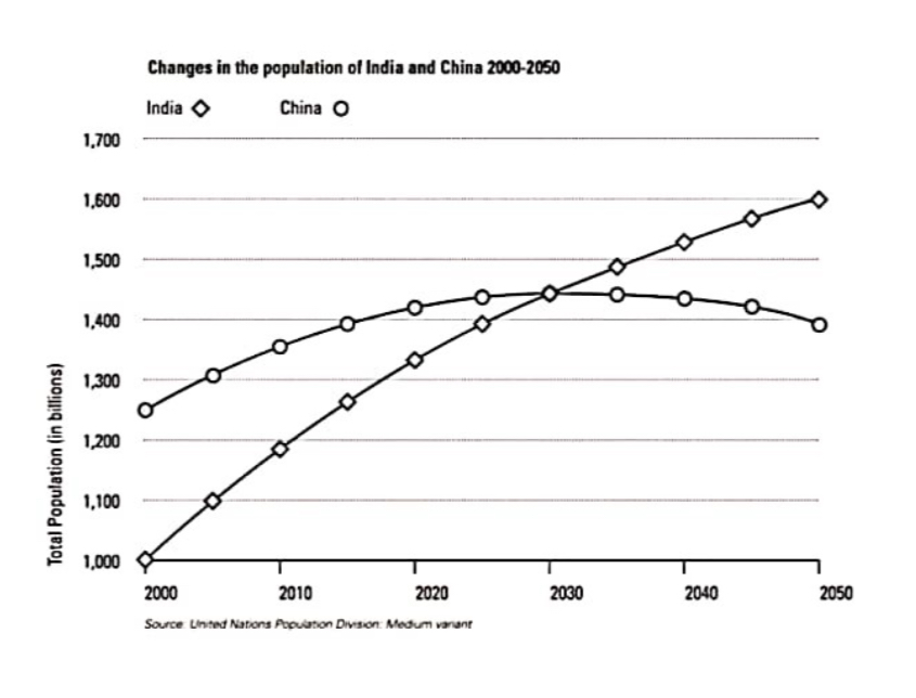
The graph compares the population growth of India and China from the year 2000 to the present day with projections for growth to the year 2050.
Both countries show great increase in their population but it can clearly be seen that India’s population is growing at a faster rate than China’s. In 2000, China’s population is higher with approximately 1.25 billion than India which had 1 billion. After that year China’s population increases at a slower rate than India which leads them to get really close by the year 2020.
The projection suggests that China’s population growth slows considerably to the point that there is no increase , while India’s gets faster which leads them to equalize in year 2030. By the year 2050, graph represents that with 1.6 billion India has more population than China with about 1.4 billion, which means that the difference between them will be around 200 million.
In conclusion, While China’s population is high at first, India rises rapidly over the years, China’s rise slows down and sometimes even decreases its population, which causes India’s population to be higher than China’s and therefore to move ahead.